Bethpage Bagels
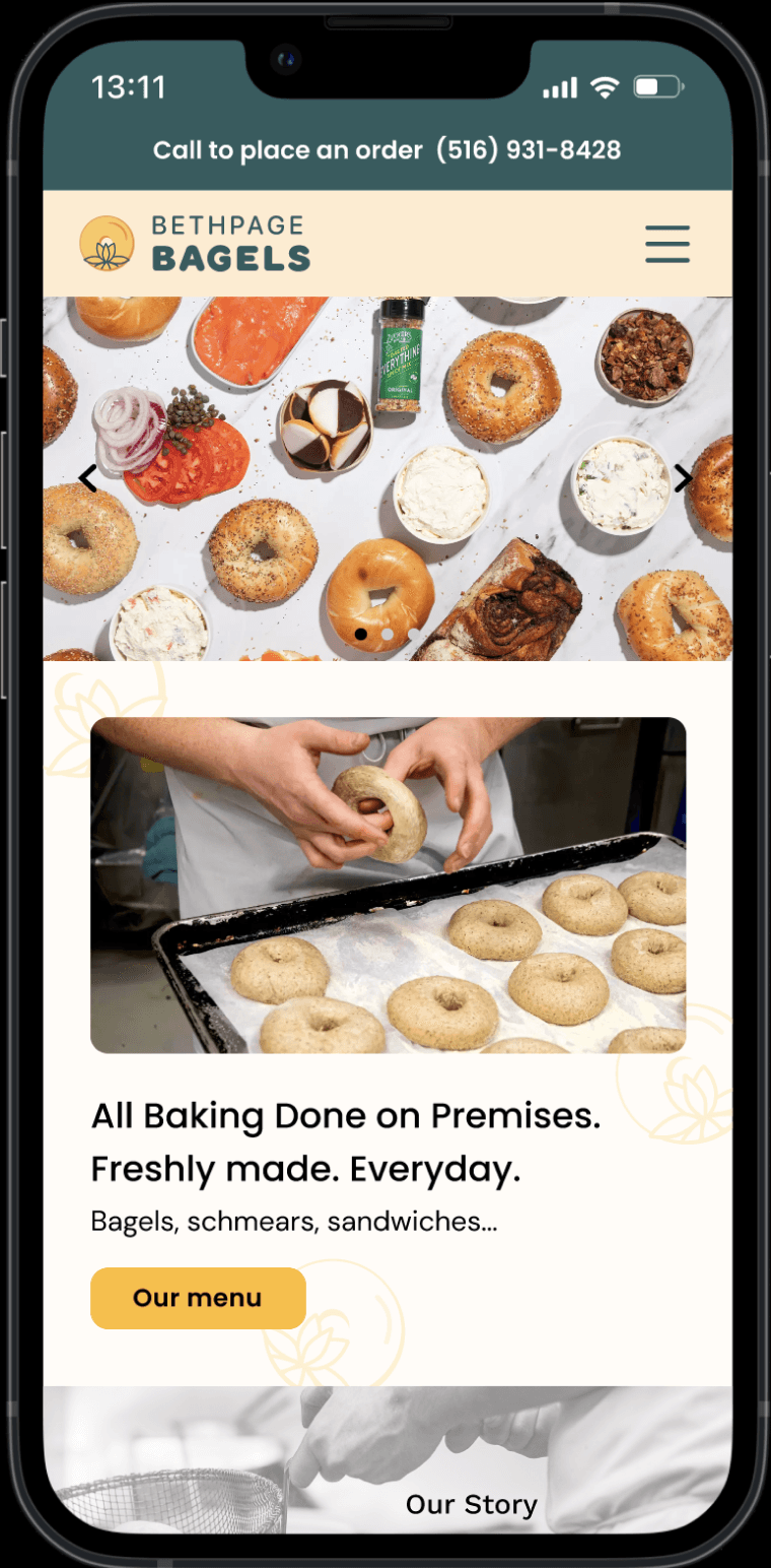
Bethpage Bagels is a family-owned small business established in 2006. They currently do not have a website and their online presence is limited to Tripadvisor, Yelp, and Google Reviews. A responsive website with an organized menu and refreshed branding was created.
ROLE
SCOPE
TOOLS
80 hours, 2 task flows
Figma, Adobe Illustrator
Skip to final design
THE PROBLEM
Bethpage Bagel's minimal online footprint makes it difficult to expand and connect with their customer base
With no website and minimal online presence, it can be difficult for existing and potential customers to find information regarding their menu options and business information. A business goal of Bethpage Bagels is to expand their demographic to a younger customer base.
DISCOVER
Research
Qualitative Data
I conducted interviews to gain a better understanding of the experience and expectations of customers navigating a small business website
Competitive Analysis
I analyzed websites of several local bagel shops and expanded my search to include online ordering apps and restaurants
“I usually go on websites if I’m looking for something that I’m not sure if they sell, so I don’t waste a trip”
“I want a unique experience that you can only have at a certain place. There is more of a personal connection to the food”
Key Findings
Filtering Content
Ratings and photos rank highest on what users look for first
Expectations
All users expect to see the menu and pricing on the website
Search Tools
All users use a mobile device and Google to search for places to eat
DEFINE
Balancing User Needs with Business Goals
The goal of Bethpage Bagel's is to expand their demographic to younger customers and increase phone orders. Initial user research indicated that customers rely on visuals and expect to find a menu when researching small food businesses. Based on these insights, I prioritized three key areas:
VISUALS
Product images that showcase the products and values of Bethpage Bagels
BRAND IDENTITY
Consistent branding that aligns with the business and enhances UX
Site Map
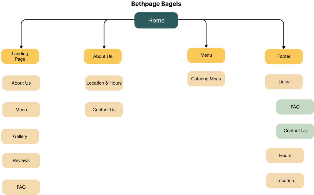
In order to better comprehend how users interact with the platform, I created a site map with the goal of creating a simple and efficient user experience.
DESIGN
Branding
The client requested the updated branding to be classic and similar to the original as to not confuse current customers. The overall branding was inspired by these keywords:
Warmth
Family
Welcoming
Current Branding
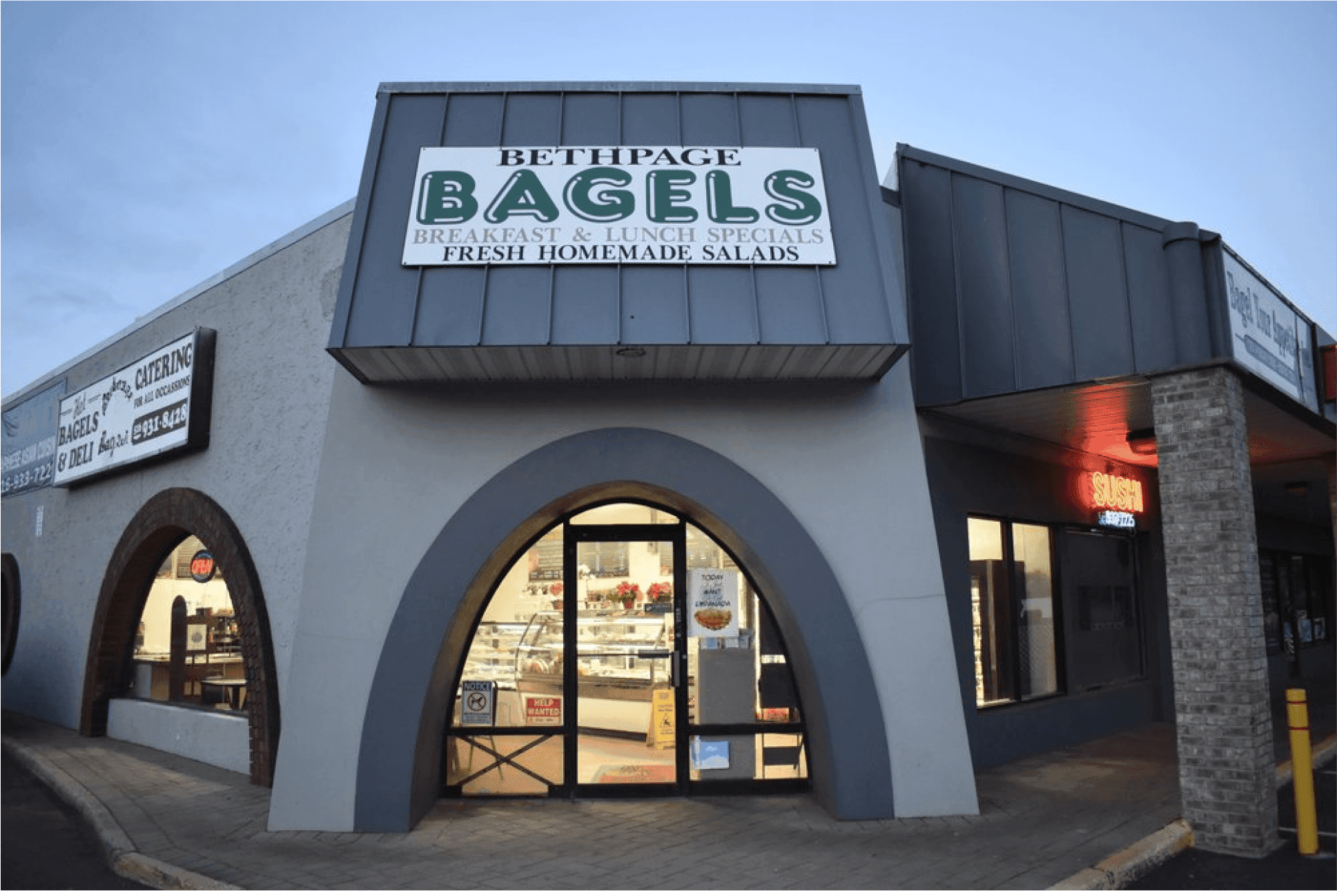
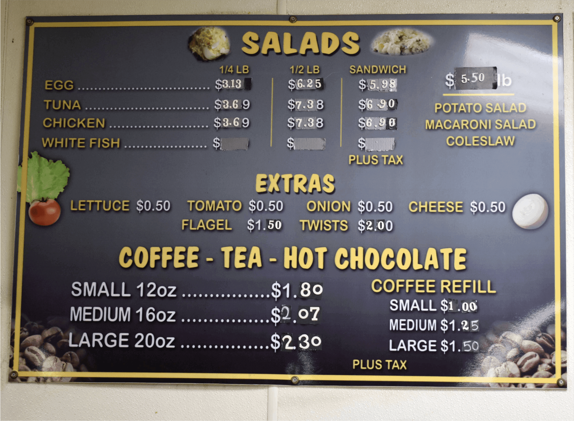
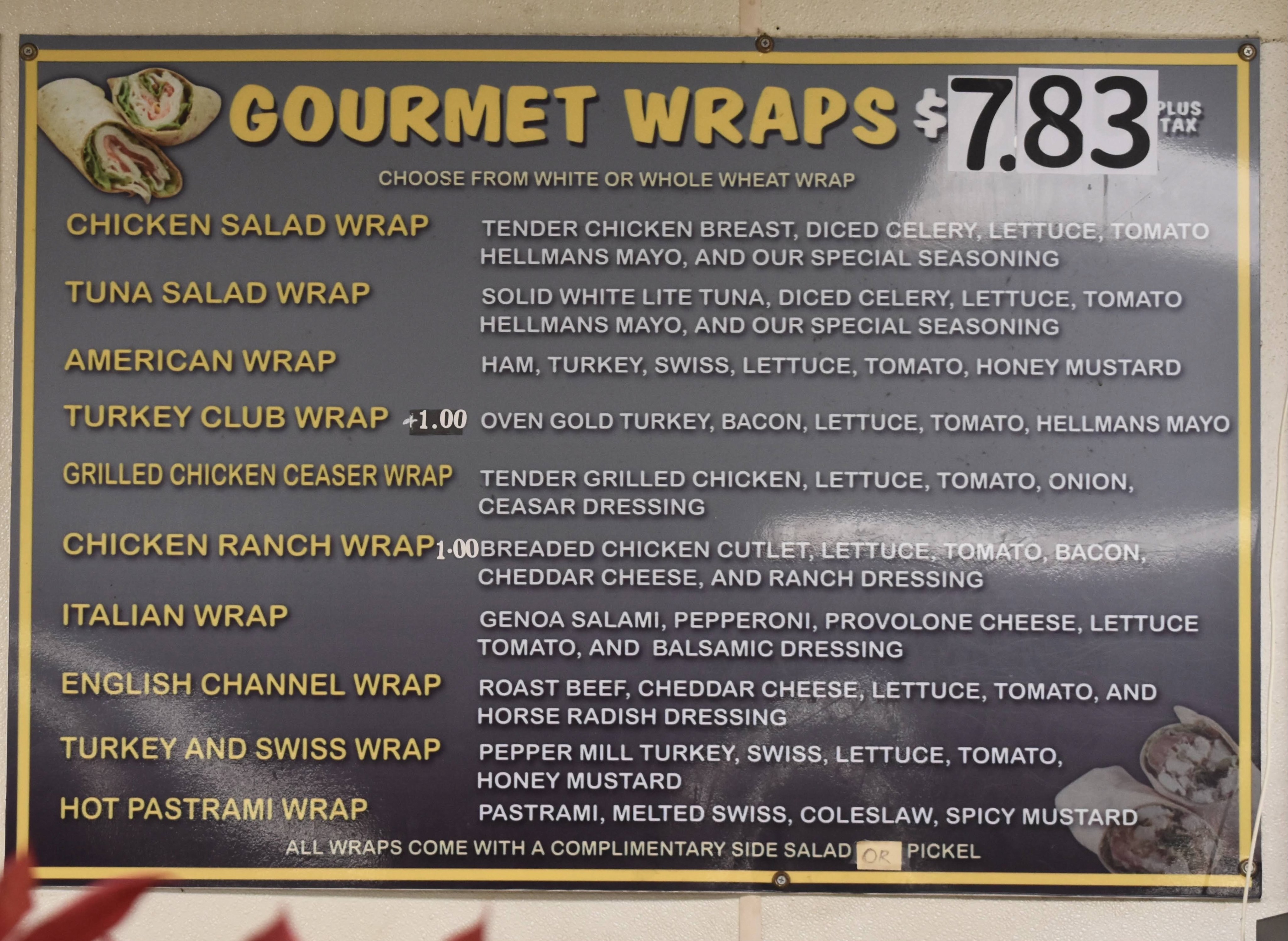
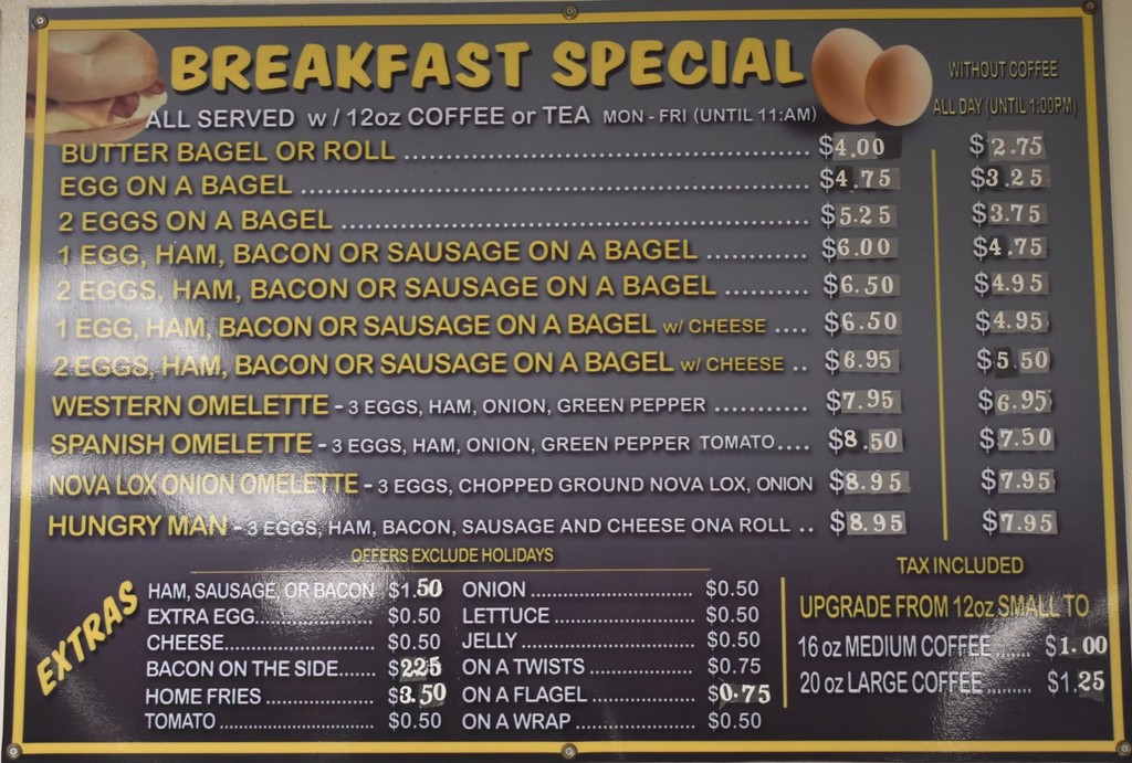
Since 1987, Bethpage Bagel's exterior and interior signage have remained unchanged, and there are no cohesive brand elements.
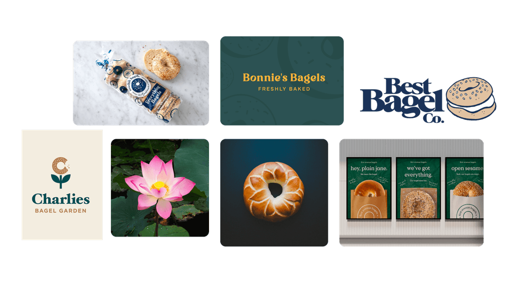
Branding Inspiration
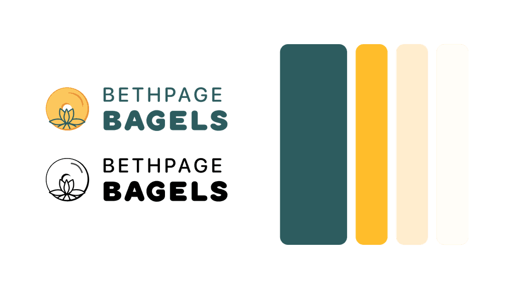
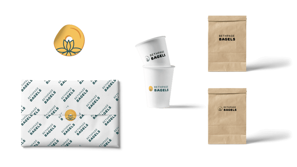
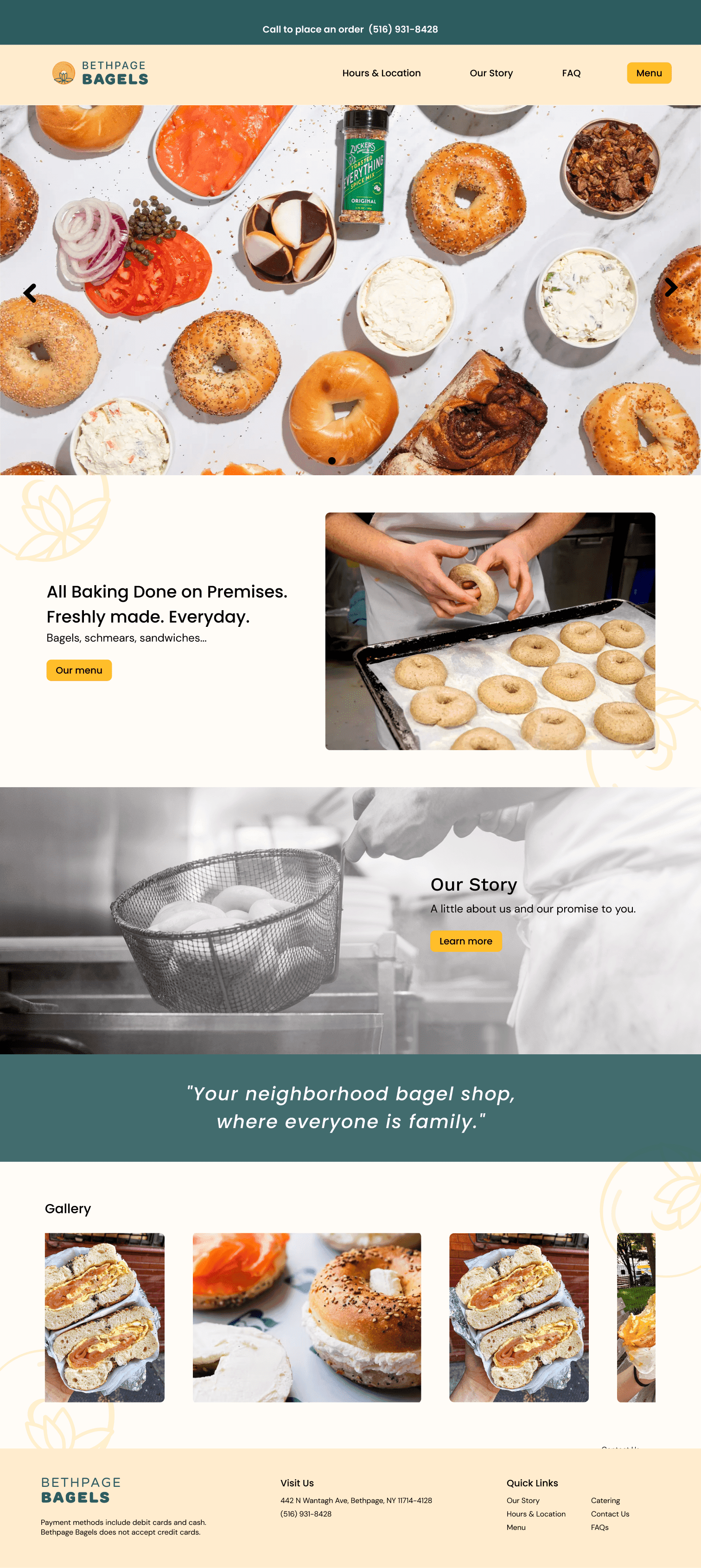
The color palette drew inspiration from the shop's original exterior signage and the warm, traditional hues of bagels. The inclusion of a lotus flower pays homage to the owner's upbringing in Vietnam.
New Branding
I opted for an analogous color scheme of green and yellow. The following slide includes mockups to enhance visual understanding.
Design Obstacles
PROBLEM: THE MENU
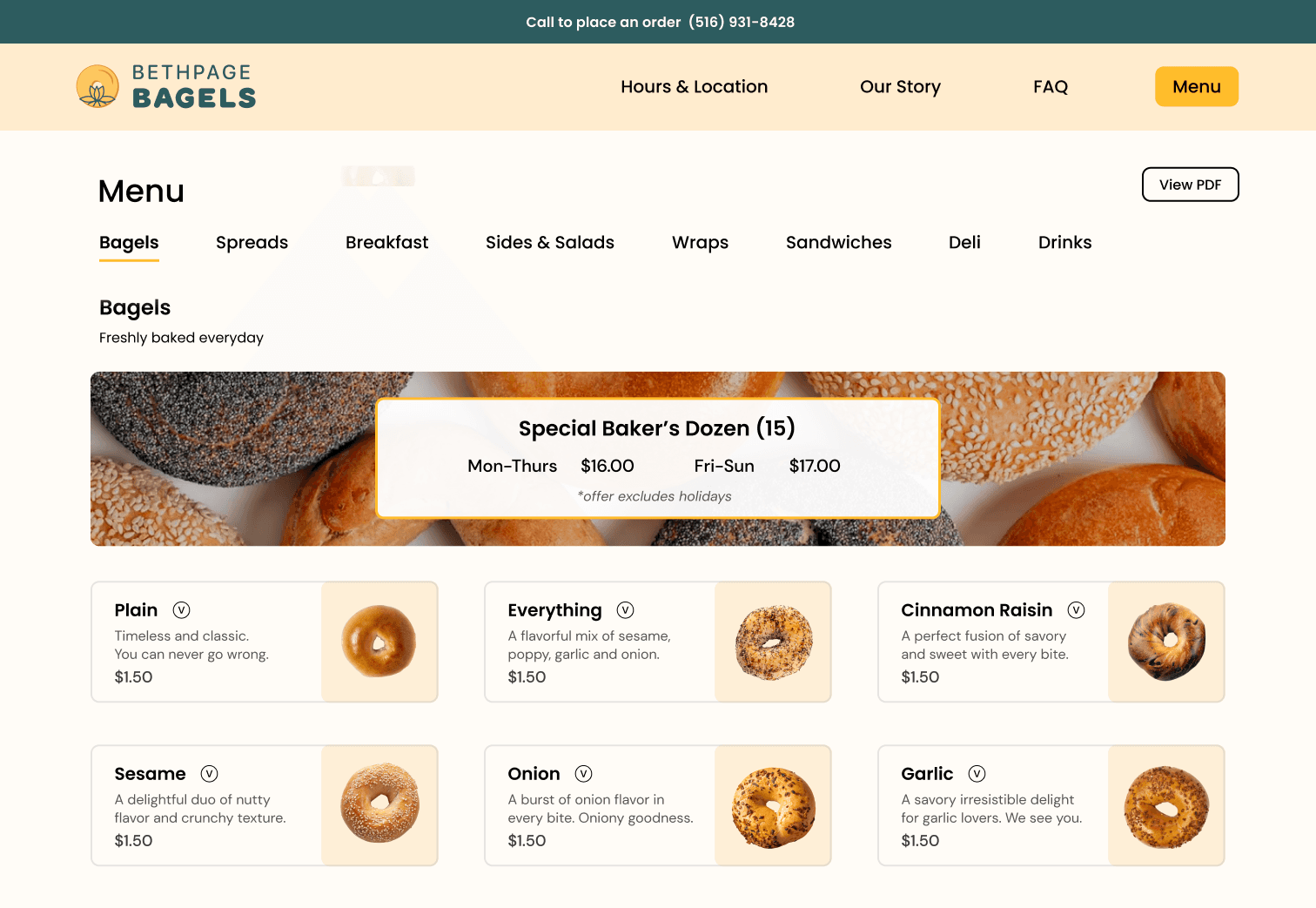
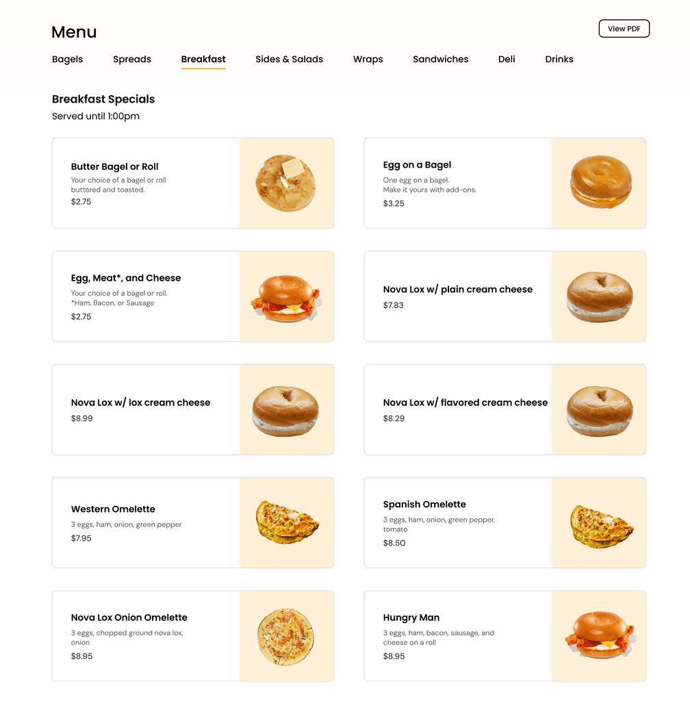
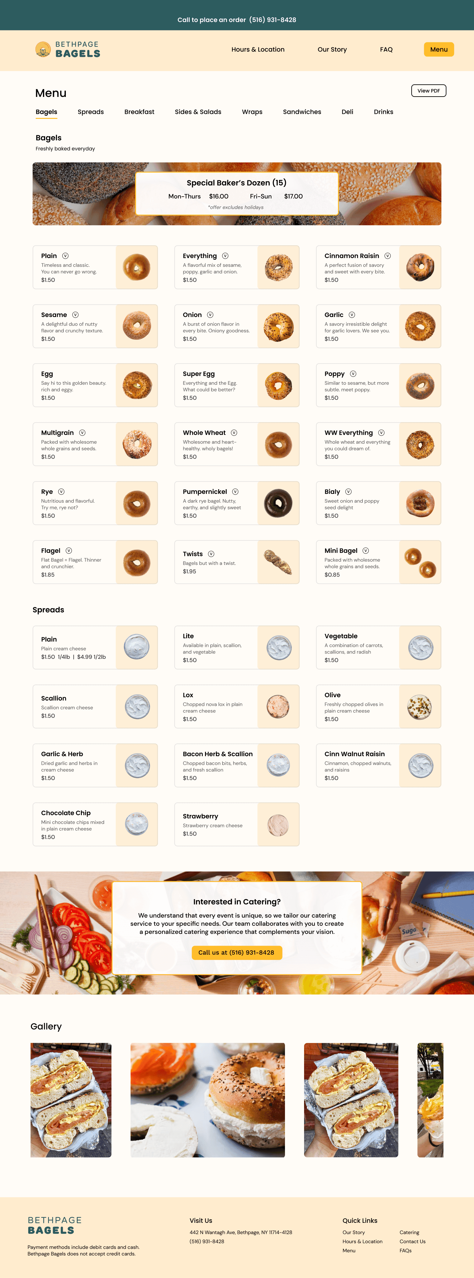
Organizing their menu of 100+ items proved to be my most challenging feat. To avoid an unappealing menu with a laundry list of items, I explored online-ordering apps like Doordash and Grubhub for visual inspiration.
SOLUTION: CARDS
My goal was to create a straightforward responsive component that included item description, price, and imagery.
large item card
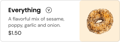
small item card
High-Fidelity Prototype
Homepage
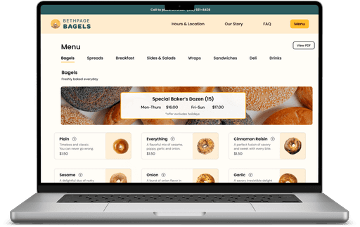
Menu
TEST
Usability Testing
I conducted moderated usability tests on Zoom for 3 users. I asked users to complete 3 tasks on the desktop website and 1 task on the mobile website.
Desktop: Find the price of a bacon egg cheese on a bagel
Desktop: What are the hours this Tuesday?
Desktop: What payments does Bethpage Bagels take?
Mobile: How much is a 1/2lb of strawberry cream cheese?
Results
100%
Completion
All tasks were completed successfully with no issues
<1 min
Efficiency
All tasks were completed under one minute
100%
Feedback
Completing tasks was described as simple
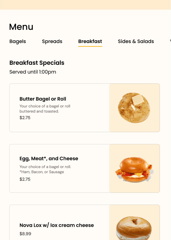
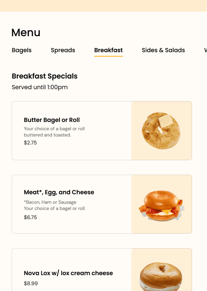
Iterating after user feedback
Most users were a bit confused when looking for the bacon egg and cheese sandwich. Based on this feedback from usability testing, I aimed to focus my efforts on 2 initiatives within the proposed user flow:
REFLECTION
What are the next steps?
I would like to focus on developing the website further with a focus on providing creative imagery and videos that feature the menu and atmosphere of Bethpage Bagels.
More testing across a broader age spectrum to match the customer base
Taking original images of Bethpage Bagel's products and location
Adding a search bar to make menu navigation easier for customers
Showcasing behind the scenes and family atmosphere through videos
Explore what's next

Enhancing the language learning experience to allow for integration of real-world experiences
UX Research
Education

A mobile app that helps users build confidence and independence in their recovery process
UX Research
System Design
Healthcare
